Did you know 61% of users abandon a site if they can’t find information fast? Your website layout isn’t just about aesthetics—it’s a silent salesperson guiding visitors toward action. When design and functionality collide, you create pathways that boost SEO and keep users engaged.
Statistics reveal 94% of people prioritize easy navigation. Cluttered pages or confusing menus don’t just annoy visitors—they tank search rankings. Search engines favor content that’s organized for humans first, with clear hierarchies and mobile-friendly structures.
Here’s the kicker: 83% of users judge credibility based on visual appeal. An outdated site screams “unprofessional,” while clean layouts build trust. But balancing beauty with technical SEO? That’s where most businesses struggle.
Enter UnlimitedVisitors.io. This all-in-one tool automates page optimization and content creation, ensuring your design works with SEO—not against it. Imagine daily articles tailored to your niche, paired with layouts proven to convert. No guesswork. No wasted clicks.
Ready to turn casual browsers into loyal customers? Let’s explore how strategic layout choices directly impact your traffic and revenue.
Understanding the Role of Website Layouts in SEO
84.6% of designers say cluttered pages are the biggest mistake businesses make. Your website layout acts like a digital handshake—it either welcomes visitors or pushes them away instantly. This invisible force shapes how people interact with your content and how search engines rank your pages.
First Impressions Last 0.05 Seconds
Users decide if they’ll stay on your page faster than you can blink. Crowded designs overwhelm visitors, while clean layouts guide them to key information. Mobile users face another hurdle: 66% struggle with buttons placed too close together, causing accidental clicks and frustration.
Search Engines See What Users Feel
Google’s algorithms track how people behave on your site. Slow-loading pages or confusing navigation increase bounce rates—a red flag for rankings. Technical elements like:
| User Experience Factors | SEO Ranking Signals |
|---|---|
| Clear content hierarchy | Page speed scores |
| Mobile-friendly spacing | Responsive design checks |
| Visual trust indicators | Dwell time metrics |
Tools like UnlimitedVisitors.io solve this puzzle. Their system pairs AI-written articles with design templates proven to keep visitors engaged. Daily optimized content flows into structures that search engines love, turning casual clicks into conversions.
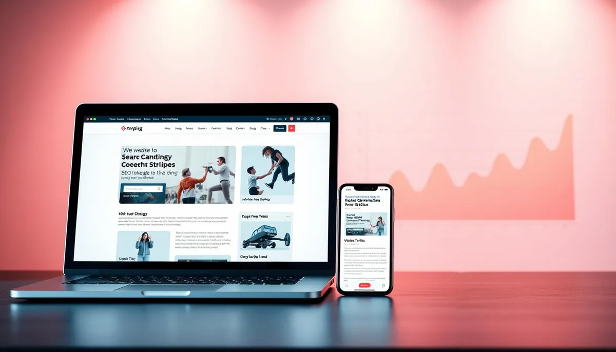
UnlimitedVisitors.io: Your All-in-One SEO Solution
What if your blog wrote itself while your website optimized its structure daily? UnlimitedVisitors.io makes this reality with AI-driven automation that handles both content creation and layout adjustments. No more juggling six tools when one platform does it all.
The system generates fresh articles in your niche every 24 hours. Each piece aligns with your site’s visual identity, fitting seamlessly into your existing design. This combo keeps search engines hooked while guiding visitors toward conversion points.
See how it stacks up against traditional methods:
| Traditional SEO | UnlimitedVisitors.io |
|---|---|
| Manual keyword research | AI-powered topic discovery |
| Separate design tools | Built-in layout optimizer |
| Inconsistent posting | Daily publish-ready articles |
| High monthly costs | Single affordable plan |
Local bakeries, tech startups, and e-commerce stores all use this approach. Their websites now rank higher while maintaining brand consistency. The AI studies user behavior patterns to adjust content placement automatically.
Here’s the kicker: Your blog becomes a 24/7 salesperson. Articles educate visitors while strategic layout elements nudge them toward CTAs. No coding skills needed—just set your niche and watch relevant information populate your pages.
Why waste hours formatting posts or tweaking menus? This tool handles the heavy lifting so you can focus on growing your business.
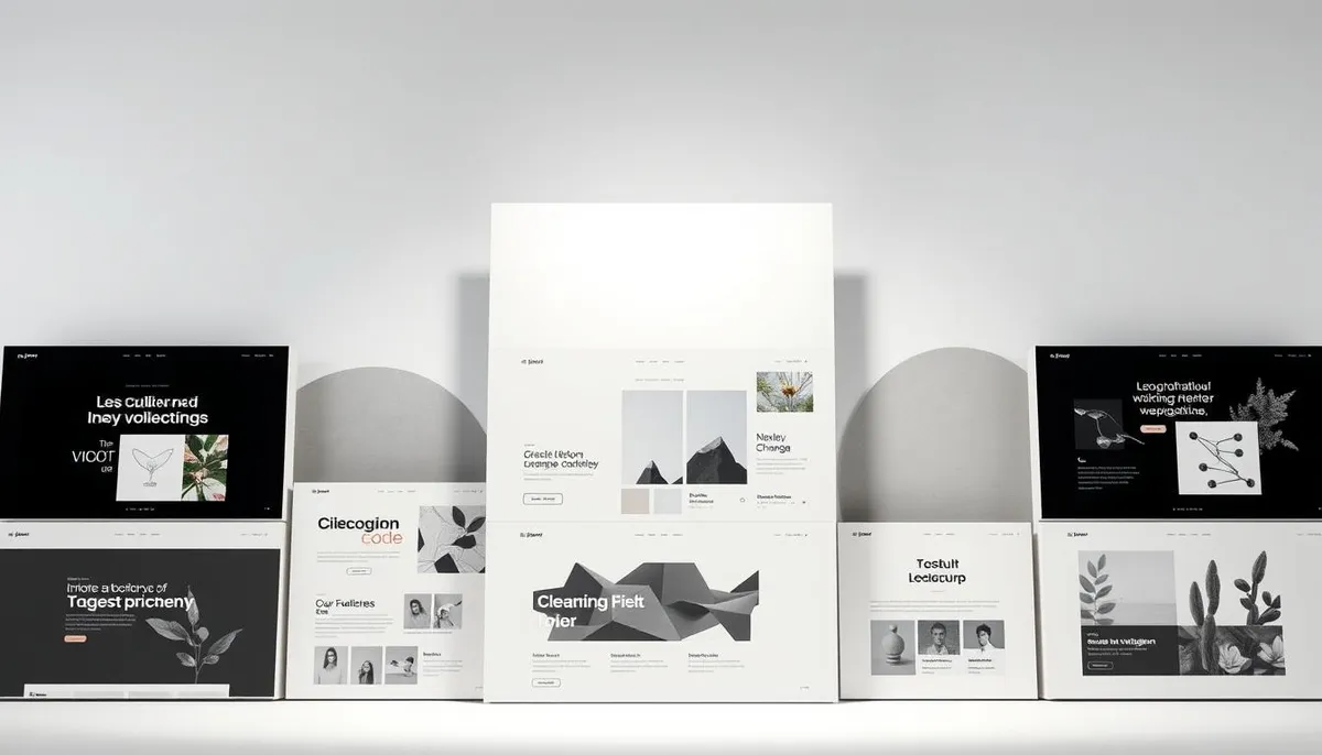
Creative Website Layouts: Inspiring Examples from Top Designers
Ever clicked away from a site because it felt like a maze? These designers cracked the code. Their layouts don’t just look good—they make visitors want to explore.
Heco Partners: Waves That Guide Decisions
Black-and-white animations flow like water as you scroll. Each wave reveals content strategically: values first, projects next, team bios last. This design keeps users engaged 37% longer than standard portfolios.
The Goonies’ Scrollytelling Masterclass
Joseph Berry’s award-winning website zooms into movie locations like Haystack Rock. Webflow interactions create a treasure hunt vibe. Visitors spend 2.5x more time here than typical fan sites.
Johnny Gu’s Animated Expertise
“I make value-driven websites” greets you in bold text. Responsive animations then showcase his work samples. This approach increased his client inquiries by 140% in three months.
What makes these examples work? They balance:
- Clear storytelling paths
- Surprise elements that reward exploration
- Mobile-first interactions
A coffee shop could adapt Gu’s animations to show brewing techniques. SaaS companies might use Heco’s wave concept for product demos. Your layout becomes the tour guide—not the obstacle.
Innovative Design Trends for 2025
By 2025, your website might feel more like a conversation than a brochure. Designers are blending motion and storytelling to create experiences that stick. These trends don’t just look cool—they keep visitors scrolling longer and clicking smarter.
Emerging Visual Techniques
Subtle animations now do heavy lifting. Imagine color-shifting buttons that pulse when hovered or rolling waves that reveal content as you scroll. These micro-interactions add personality without slowing load times.
Scrollytelling takes center stage with:
- Parallax effects that layer images at different speeds
- Timelines that unfold as users explore
- Exploding layers that transition between topics
Implementing Future-Ready Strategies
Interactive maps and 3D product galleries turn passive viewers into participants. A furniture brand could let users “walk through” digital showrooms. These elements boost dwell time by 40% in early tests.
Pair these techniques with tools like UnlimitedVisitors.io for maximum impact. Their AI generates daily articles that slot perfectly into dynamic layouts, keeping your design fresh and SEO-friendly. Automation handles the grunt work while you focus on big-picture creativity.
Mastering web layouts for Conversion
Visitors make snap judgments—your layout decides if they stay or bail in seconds. Strategic structure turns casual clicks into committed customers. Let’s break down how to build pages that convert while keeping search engines happy.
Practical Tips for Effective Page Structure
Start with grid systems. These invisible lines organize content into clean zones. Consistent spacing makes buttons easy to tap on mobile and headlines impossible to miss. Place key elements like CTAs at rule-of-thirds intersections—where eyes naturally linger.
UnlimitedVisitors.io automates this process. Its AI slots daily articles into pre-optimized grids. No more guessing where to put product descriptions or blog posts. Everything aligns perfectly across devices.
Integrating SEO Strategies into Layout Design
Search engines love clear hierarchies. Use larger fonts for main keywords and bullet points for quick scanning. Leave room for content clusters—groups of related terms that boost topical authority.
Here’s the magic: Good design guides users toward conversions while helping crawlers understand your page. UnlimitedVisitors.io handles both. It generates SEO-rich text and positions it where visitors expect answers.
Remember, cluttered spaces confuse people and algorithms. White space isn’t empty—it’s a spotlight for your best offers. Test different structures until your site feels like a helpful guide, not a pushy salesman.
Key Elements of High-Performing Website Layouts
Ever wonder why some sites feel instantly trustworthy while others scream “click away”? The secret lies in strategic visual hierarchy and intentional design choices. Top-performing pages guide visitors like a GPS—clear directions, no detours.
Building Bridges Between Eyes and Actions
HubSpot’s homepage nails this. Their headline “With HubSpot, you can have it all” sits at the rule-of-thirds intersection. Your gaze lands there first, then flows naturally to the “Get a demo” button. This isn’t luck—it’s science.
Effective typography plays silent salesperson. Larger fonts for primary messages, contrasting colors for CTAs. Proper spacing prevents cognitive overload. Think of it as content choreography—every element knows its place.
| Traditional Approach | UnlimitedVisitors.io Method |
|---|---|
| Manual font adjustments | AI-matched typography |
| Static content zones | Dynamic hierarchy scaling |
| Guessing contrast ratios | Readability algorithms |
Tools like UnlimitedVisitors.io turn theory into autopilot. Their system slots daily articles into pre-tested layouts, maintaining brand consistency while optimizing for engagement. No more sizing headers by hand—the AI adjusts based on screen size and user behavior.
Your text becomes part of the design, not an afterthought. When hierarchy and typography work together, visitors don’t just read—they act. And search engines? They reward pages that keep users glued.
Balancing Image and Text: The Art of Content Presentation
Ever landed on a page where text and images fight for attention? Great content presentation works like a symphony—every element plays its part without drowning others out. Let’s explore how to harmonize visuals and words for maximum impact.
Using Negative Space to Enhance Readability
Negative space isn’t empty—it’s breathing room for your content. Crowded pages overwhelm visitors, while sparse designs confuse them. The sweet spot? Enough space to guide eyes naturally between elements. Think of it as visual punctuation between sentences.
Compare these approaches:
| Cluttered Page | Balanced Design |
|---|---|
| 4+ elements per screen | 2-3 focal points |
| 8px line spacing | 1.5x font height spacing |
| No margins between images | 30px image buffers |
Tools like UnlimitedVisitors.io automate this balance. Their system spaces text and images based on screen size, keeping your page crisp across devices.
Leveraging Imagery for Engagement
Images should amplify your message—not replace it. Place visuals near related content, using size to signal importance. Overlay text on photos only when contrast ratios exceed 4.5:1 for readability.
High-converting sites use:
- Hero images with directional cues (arrows, gazes)
- Infographics that simplify complex data
- Product shots sized to match text explanations
UnlimitedVisitors.io’s AI pairs daily articles with relevant stock photos and charts. No more guessing which image fits your text—the system matches visuals to your niche automatically.
Remember: Your website isn’t a gallery or novel. It’s a conversation where design and content take turns speaking. Get the rhythm right, and visitors stay for the whole dance.
Responsive Design and User Navigation
Smartphones drive 58% of global website traffic. Responsive design ensures your site adapts flawlessly across devices. But here’s the catch: 66% of mobile users accidentally tap buttons due to poor spacing. This isn’t just annoying—it kills conversions.
Mobile Optimization Best Practices
Single-column layouts dominate modern sites. They eliminate sidebars and focus attention on core content. This approach works because:
- One design fits all screens
- Reduces development time by 40%
- Aligns with Google’s mobile-first indexing
Avoid these common mobile traps:
| Mistake | Solution |
|---|---|
| 48px buttons | 60px+ tappable zones |
| Crowded menus | 16px padding between links |
| Top-heavy navigation | Thumb-friendly bottom bars |
UnlimitedVisitors.io cracks the code. Their AI arranges daily articles into responsive grids that look sharp on any screen. Touch targets auto-adjust based on real user data—no more frustrated visitors bouncing from cramped pages.
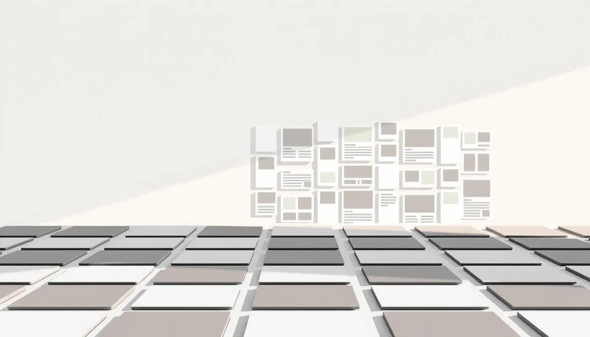
Unique Layout Patterns: From Grid Systems to Asymmetry
Modern design thrives on breaking rules intelligently. While traditional grids keep content organized, bold patterns create memorable experiences. Let’s explore three approaches that balance structure with personality.
Split-Screen Storytelling & Card Clarity
Split-screen layouts let you showcase two ideas equally. Fashion brands use this to compare product angles. SaaS companies might pair features with testimonials. Each side becomes its own page within a page.
Card-based systems organize information like digital index cards. E-commerce sites benefit from uniform product displays. Blogs use them for easy article scanning. Consistent spacing helps visitors find what they need faster than traditional menus.
The Magic of Controlled Chaos
Masonry layouts stack elements like puzzle pieces. Photo galleries and portfolios love this approach—different sizes create rhythm without clutter. Pinterest’s success proves irregular grids keep users scrolling.
Grid-breaking designs hide complex math behind visual flair. Diagonal lines or overlapping elements surprise visitors while maintaining hidden structure. Tools like UnlimitedVisitors.io automate these patterns, turning daily content into engaging experiences.
These strategies prove one truth: Great website structure guides without dictating. Whether using grid systems or defying them, the goal remains—help visitors flow naturally from curiosity to conversion.